Refreshing a Baby Brand for New Generations
🍼
Refreshing a Baby Brand for New Generations 🍼
Client: Munchkin
Project Type: Branding, Packaging
Team: In-House
Role: Graphic Designer
The Opportunity
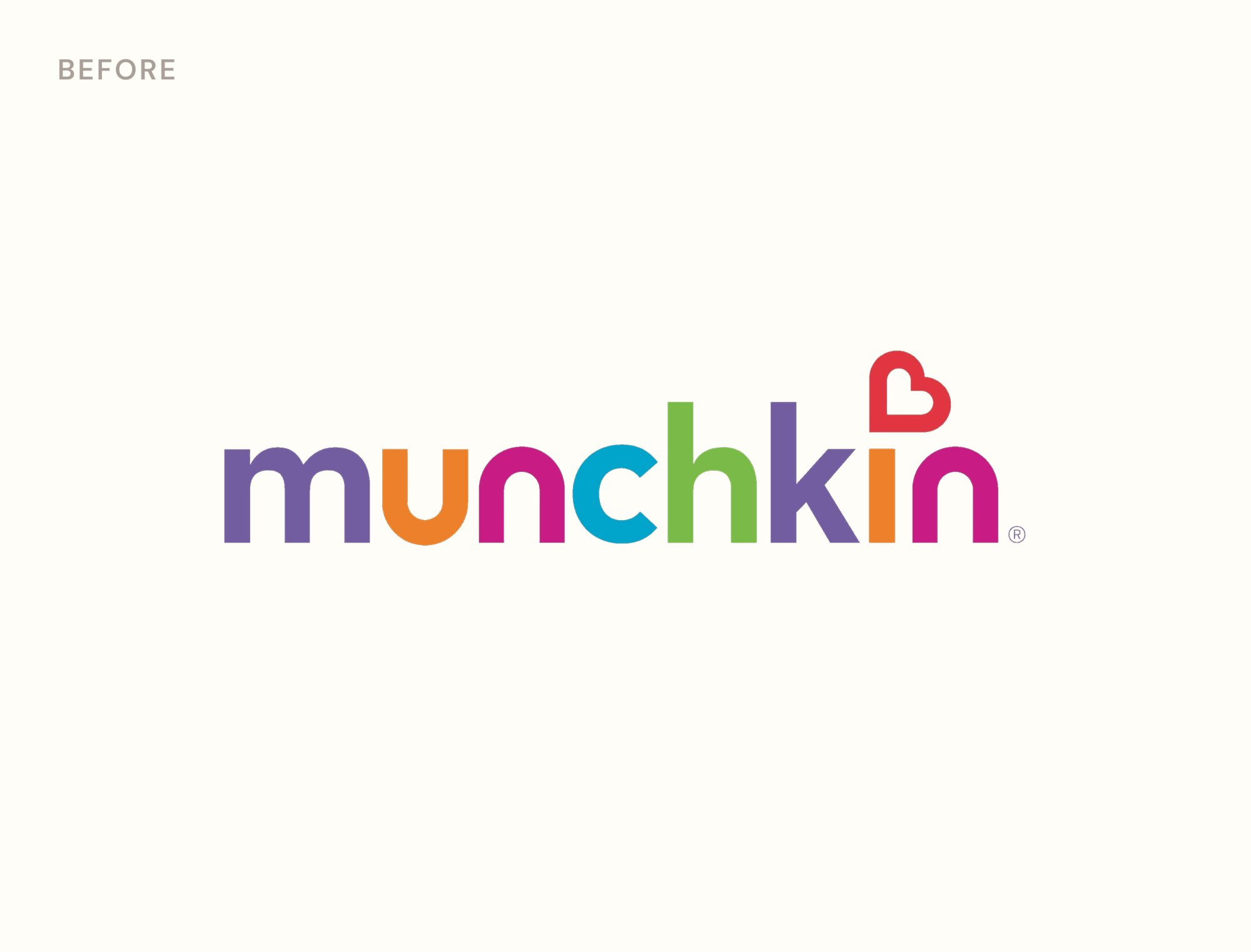
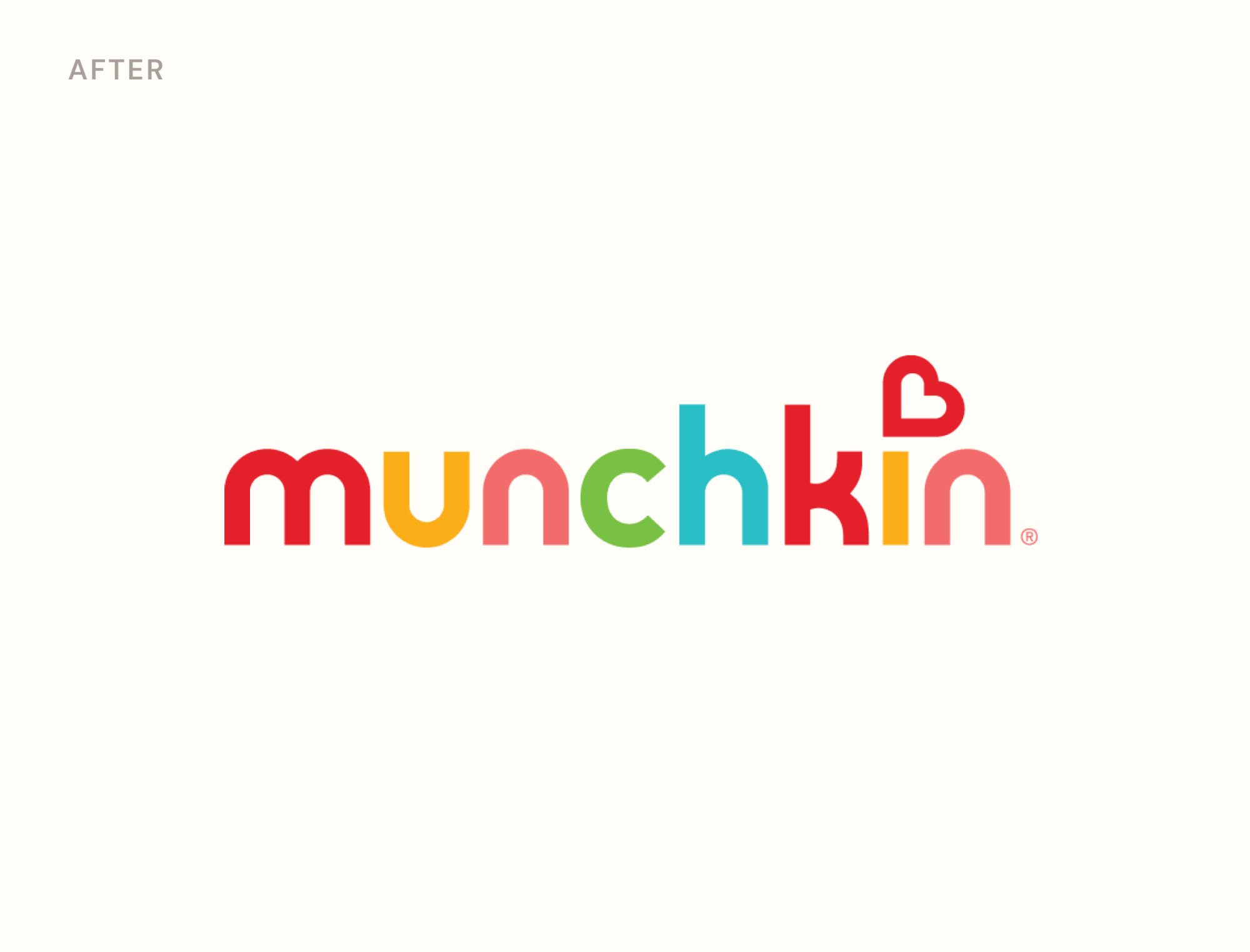
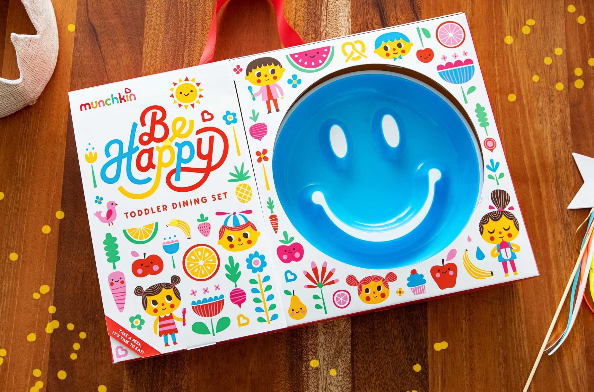
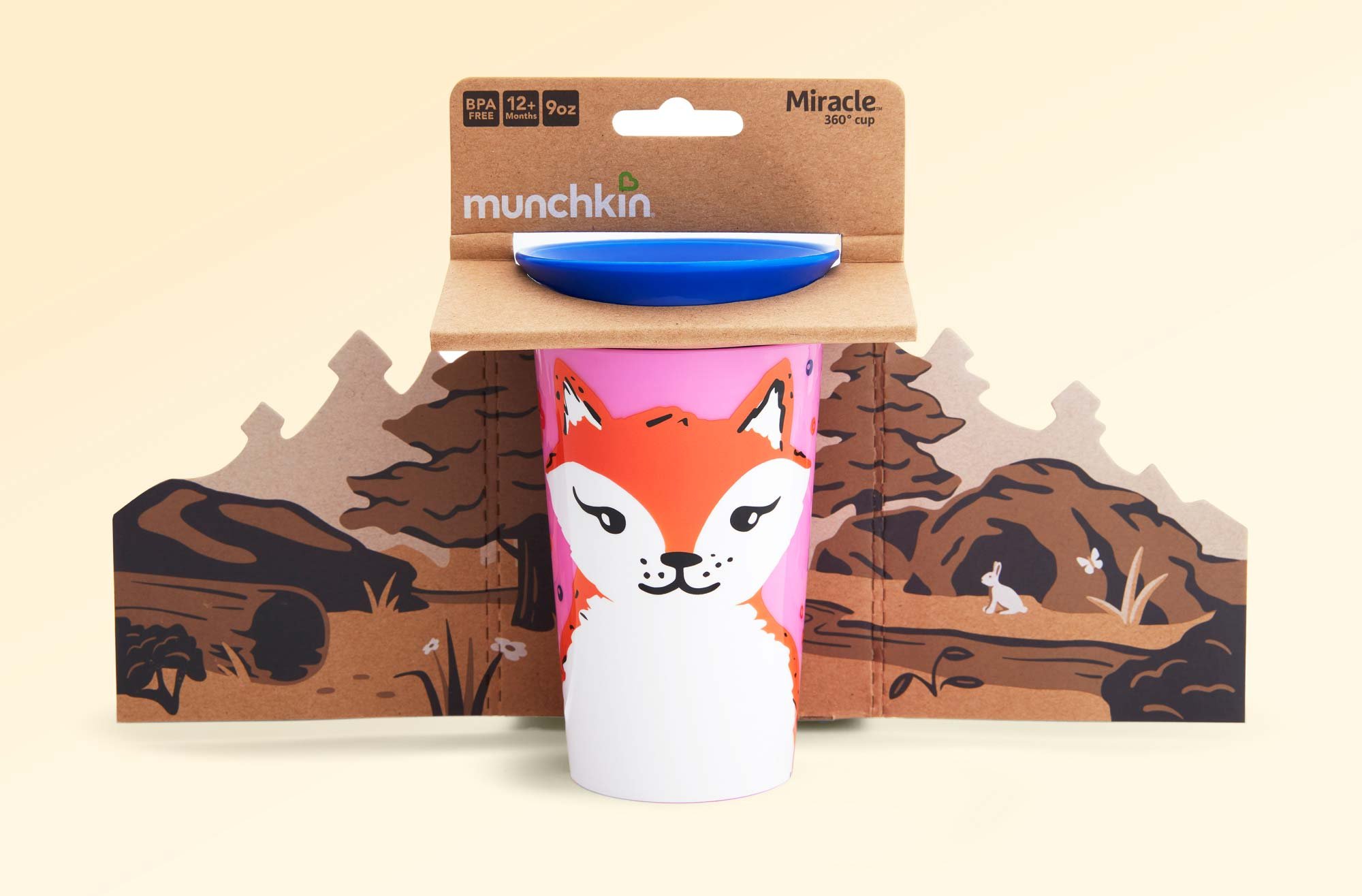
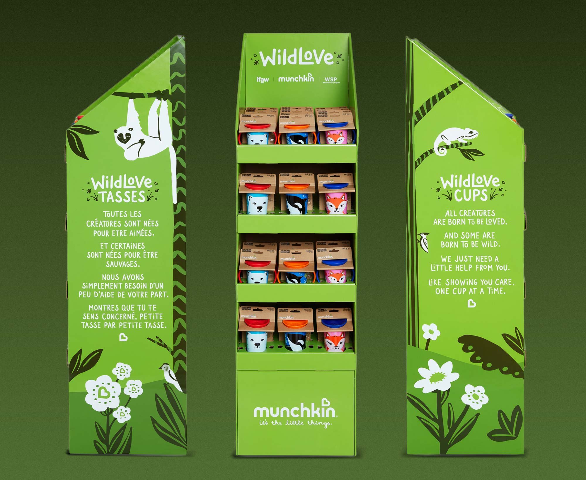
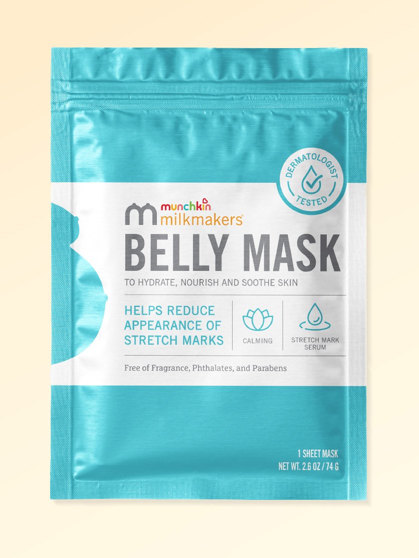
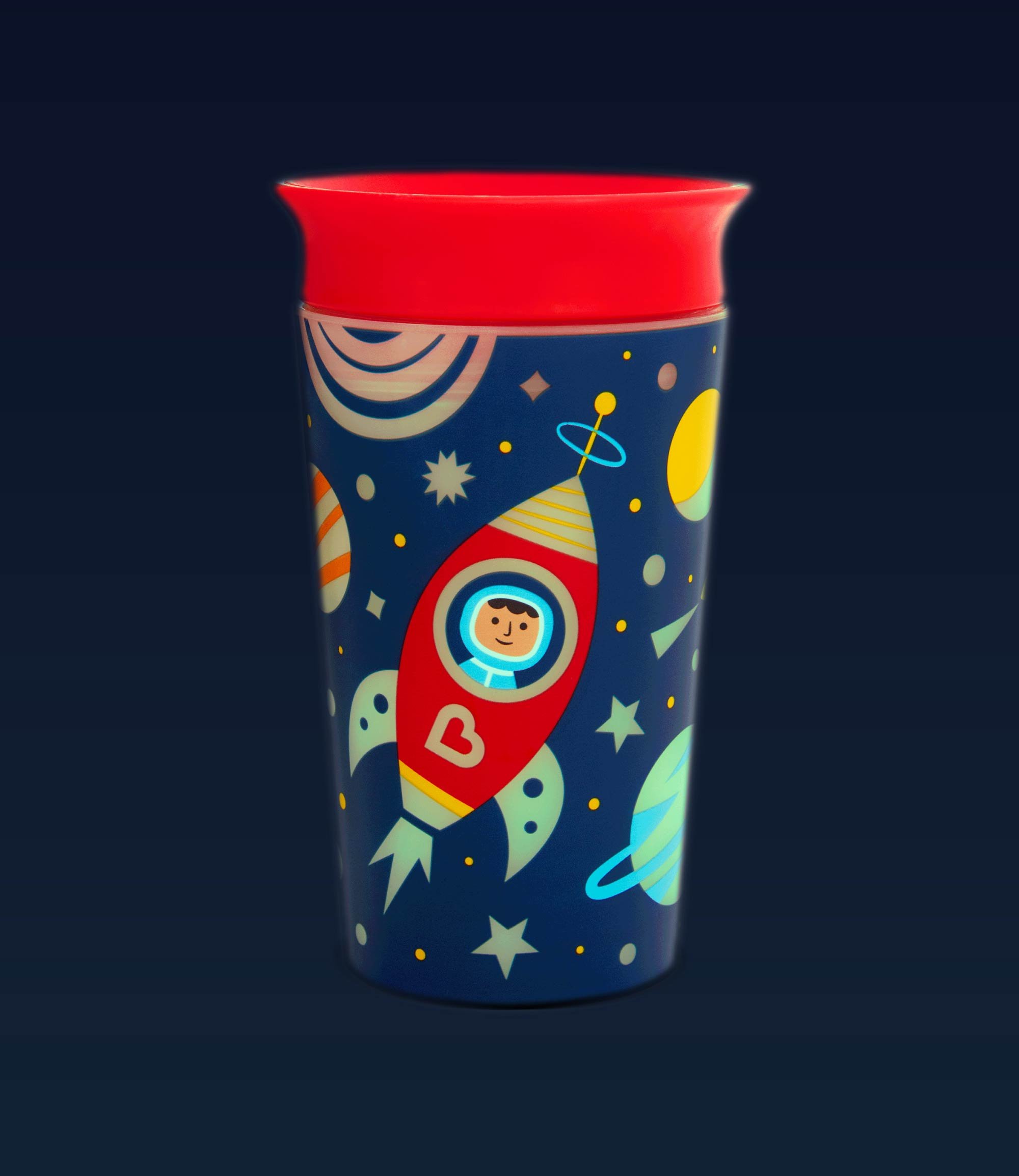
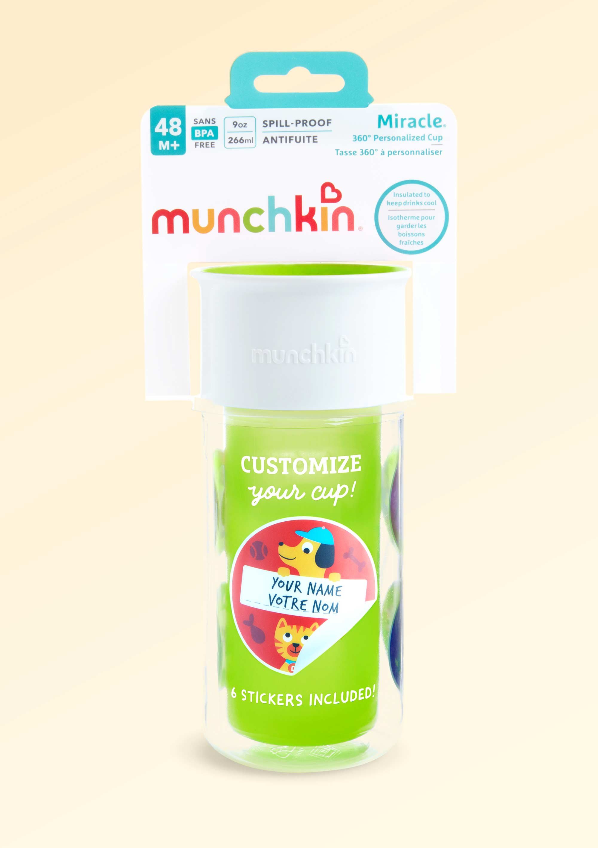
Munchkin needed a fresh look that kept its playful heart. I contributed to evolving the identity—working on the brand’s logo refresh, packaging updates, and expansions into new product categories.

The Apporach
We refined the Munchkin logo, evolving the letterforms while keeping the heart symbol. We also refreshed the packaging system and added a color-coded age tab for greater clarity and consistency. Throughout, we amplified the brand’s playful personality through packaging and illustration.
The Result
The refresh landed across every product line, keeping Munchkin fun, parent-friendly, and shelf-ready for today.
Photography: Leah Rose
Made at Munchkin