Making a Big Grocery Brand Feel More Local
🥝
Making a Big Grocery Brand Feel More Local 🥝
Client: Sprouts Farmers Market
Project Type: Visual Identity
Team: Meaningful Works
Role: Assoc. Design Director
The Opportunity
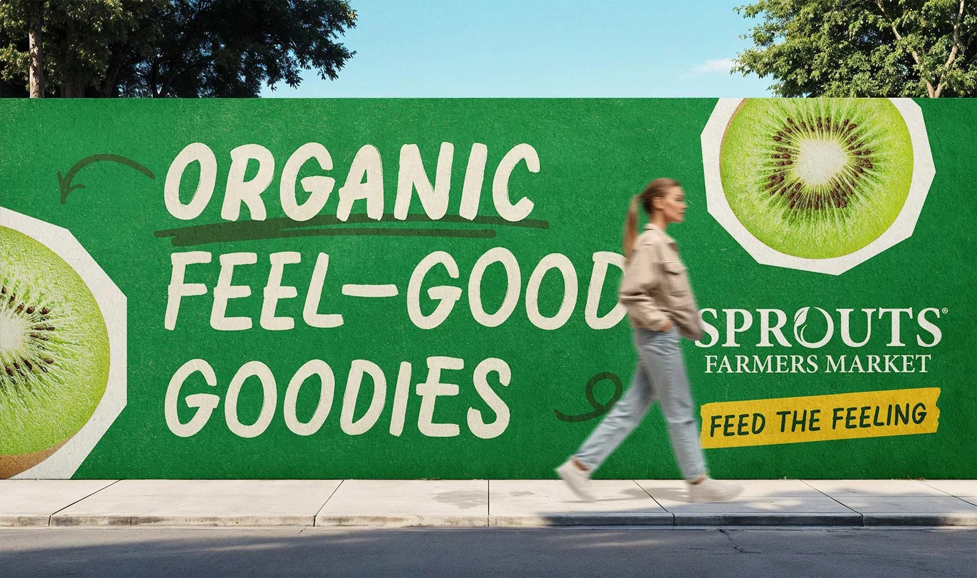
After the pandemic, Sprouts felt too screen‑first. A constrained color palette and polished typeface didn’t match the open‑air vibe of shopping in‑store. The brand needed an identity rooted in the real market—and flexible enough to scale.

The Approach
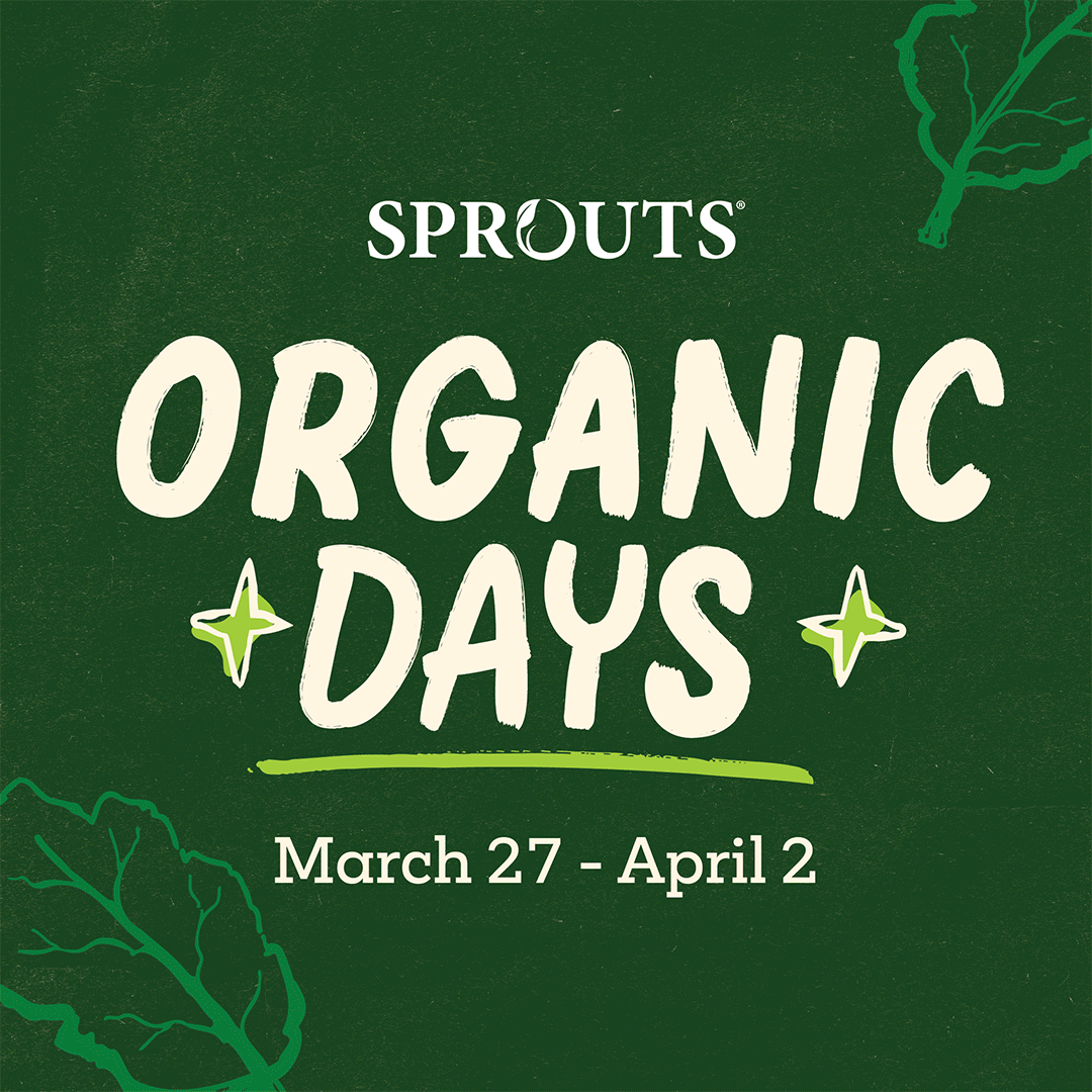
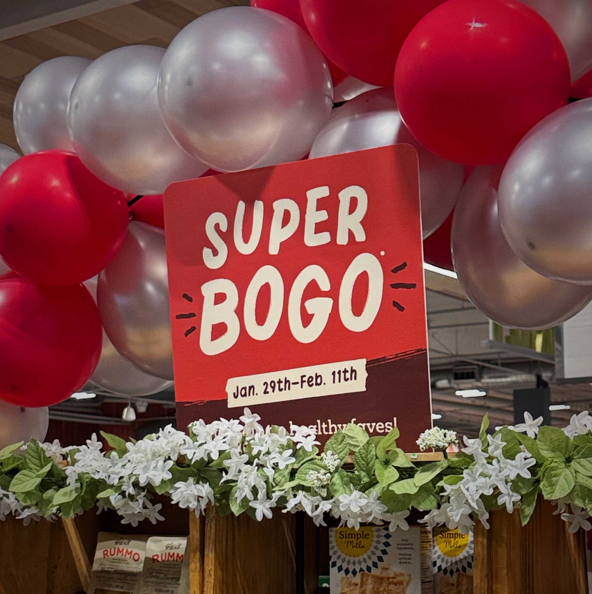
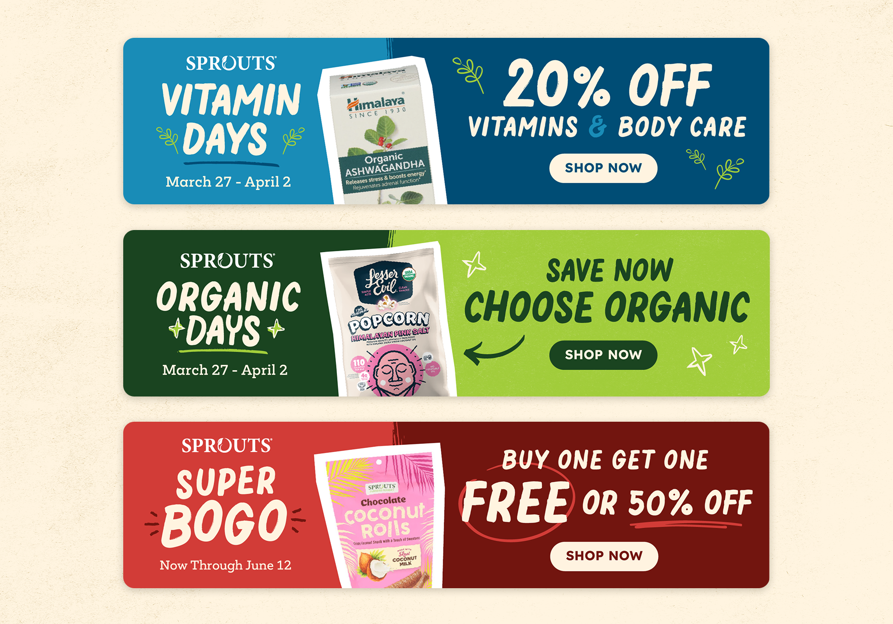
We borrowed from actual farmers markets: hand‑lettered tags, layered textures, produce‑fresh greens. A custom hand‑drawn typeface and a practical kit of parts let every store feel home‑grown yet unmistakably Sprouts.
The Result
Rolling out nationwide in 2025, the system now lets every store feel homegrown while keeping the brand cohesive.
Created at Meaningful Works